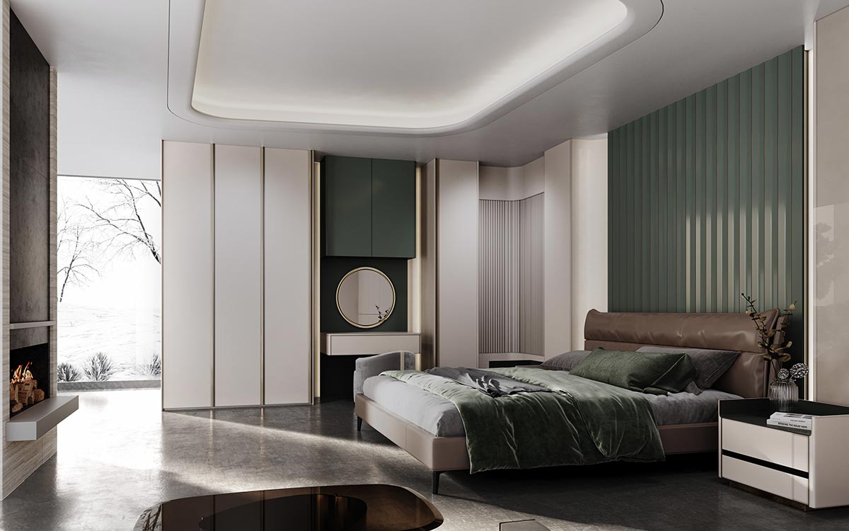
provide one -stop project solution
How to Choose Kitchen Cabinet Colors: The Ultimate Guide for a Timeless Design
Selecting the perfect kitchen cabinet colors is more than just an aesthetic decision—it influences the entire ambiance of your home, affects resale value, and determines how well your space withstands evolving trends. Whether you’re renovating or building from scratch, this comprehensive guide will help you navigate the complexities of color selection with confidence.
1. Consider Your Kitchen’s Natural Lighting
First and foremost, evaluate how much natural light your kitchen receives. North-facing rooms with cooler light benefit from warm tones like cream or light oak, which counteract the bluish cast. Conversely, south-facing spaces flooded with sunlight can handle deeper hues like navy or charcoal without feeling oppressive.
Additionally, observe how colors change throughout the day. A pale gray might appear crisp in the morning but dull by evening, while a bold green could shift from vibrant to muted.
2. Align with Your Home’s Architectural Style
For a cohesive look, your cabinet color should harmonize with your home’s architectural character. For instance:
- Modern homes thrive in monochromatic schemes (e.g., high-gloss white or matte black).
- Traditional spaces demand classic wood stains or muted blues/greens.
- Farmhouse kitchens lean toward distressed whites or sage green.
Nevertheless, don’t feel constrained—a well-executed contrast (like ebony cabinets in a rustic kitchen) can create stunning visual tension.
3. Factor in Long-Term Trends vs. Timelessness
While trendy colors (millennial pink, anyone?) may seem appealing now, it’s critical to weigh their longevity. According to a 2023 National Kitchen & Bath Association (NKBA) report, 72% of designers recommend neutral bases (white, gray, beige) for cabinets, accented with colorful backsplashes or hardware for flexibility.
That said, if you adore bold shades, consider painting lower cabinets a daring hue (e.g., emerald) while keeping uppers neutral—a balanced approach that’s easier to update.
4. Test Samples Under Real Conditions
Never rely solely on digital swatches or store lighting. Instead:
- Order large physical samples.
- Tape them to cabinets and observe for 3+ days.
- View them at different times and under artificial light.
Pro Tip: Pair samples with countertops and flooring to avoid clashing undertones (e.g., cool gray cabinets with warm wood floors can feel disjointed).
5. Psychological Impact of Colors
Beyond aesthetics, colors evoke emotions:
- White: Clean, expansive (ideal for small kitchens).
- Blue: Calming (great for busy households).
- Black: Sophisticated but requires ample lighting.
A study by the University of Texas found that yellow-stimulating hues (like cream) may subtly boost energy levels—useful for morning cooking routines.
Final Checklist Before Deciding
✅ Coordinate with fixed elements (countertops, flooring).
✅ Assess maintenance needs (glossy shows fingerprints; matte hides stains).
✅ Consider resale value (neutral palettes appeal to 89% of buyers per Zillow).
Need Professional Advice? Our design team can take a 3D rendering to visualize your dream kitchen. Contact us today for a free consultation.
📞 Call: +86 181 0026 4997
📧 Email: stuya8@stuya127.com